Spring family · also called Clear Spring
Bright Spring Color Palette
The Bright Spring color palette (sometimes called Clear Spring) is clear, saturated and warm-leaning: watermelon, turquoise, lemon, clear green and bright periwinkle, with clear ivory, navy and espresso as anchors. Each swatch below shows its hex code.
What is the Bright Spring color palette?
Bright Spring (also called Clear Spring) is all about clarity. The colors are saturated and clean, warm-leaning but with enough coolness to include bright blues and violets. Think watermelon, turquoise, lemon and clear green.
People who suit this palette often have noticeable contrast or sparkle: bright eyes, clear skin, defined features. Soft, dusty colors can make them look dull or tired, while vivid color makes everything look sharper and more awake.
Typical Bright Spring characteristics
- Undertone
- Warm-neutral: mostly warm, with a slight cool component.
- Depth (value)
- Medium; can range from light to medium-deep.
- Chroma
- High. This is one of the two clearest palettes.
- Contrast
- Medium to high between hair, skin and eyes.
Bright Spring colors with hex codes
36 colors in four groups. Click or tap any swatch to copy its hex code. Screens and fabrics vary, so treat the values as a guide rather than exact shopping targets.
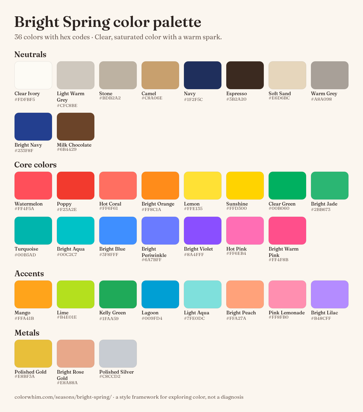
Bright Spring neutrals 10 · Your basics: coats, trousers, bags and shoes.
Bright Spring core colors 15 · The heart of the palette (these are also the virtual drapes in the ColorWhim tool).
Bright Spring accents 8 · Extra shades for tops, scarves, prints and statement pieces.
Bright Spring metals 3 · Jewelry, buttons, watch straps and frames.
Colors to approach carefully
Not forbidden, just harder to wear close to the face. Away from the face (trousers, bags, shoes) almost anything goes.
- Dusty Rose
#C9A0A0
Greyed colors look dull next to clear, high-energy coloring. - Muted Olive
#8A8A5C
Earthy and soft; it can flatten your natural brightness. - Mushroom
#A99C8F
Mid-tone, low-chroma neutrals can wash you out. - Taupe Grey
#9A8F86
Too soft to stand up to your contrast. - Oxblood
#5A1F24
Heavy and dark without the clarity you need.
Bright Spring vs neighboring seasons
Seasons are neighborhoods, not boxes. If you’re unsure, these are the palettes Bright Spring is most often confused with.
Bright Spring vs Bright Winter
Bright Spring and Bright Winter are the two clearest palettes, and they’re easy to mix up. Bright Spring keeps a warm spark (coral, lemon, warm pink), while Bright Winter is cooler and icier (hot pink, electric blue, icy lemon). Compare hot coral with shocking pink: if the coral looks more natural, lean Bright Spring.
Bright Spring vs True Spring
True Spring is warmer and a touch softer, without the bright blues and violets. If pure golden warmth flatters you more than high-contrast brights, True Spring may fit better.
Bright Spring vs Light Spring
Light Spring is lighter and gentler. If Bright Spring colors feel like too much and you look better in pastel versions of the same hues, compare Light Spring.
Bright Spring outfit ideas
Color-block
Turquoise #00B5AD · Watermelon #FF4F5A · Clear Ivory #FDFBF5
Two brights together with clear ivory as a break.
Workwear with a spark
Navy #1F2F5C · Bright Blue #3F8FFF · Clear Ivory #FDFBF5
A navy suit, clear ivory shirt and a bright blue accessory.
Holiday
Lemon #FFE135 · Bright Aqua #00C2C7 · Polished Gold #E8BF3A
A lemon top with bright aqua shorts and polished gold sandals.
One vivid piece
Hot Coral #FF6F61 · Espresso #3B2A20 · Stone #BDB2A2
If a fully bright outfit feels like too much, wear one vivid top and keep the rest neutral.
How to wear the Bright Spring palette
- Don’t be afraid of two bright colors together (turquoise + watermelon, lemon + bright blue). Contrast is your friend.
- Navy or espresso work as dark anchors; black can work in small doses next to the face if paired with a bright color.
- Choose clear ivory or bright, clean white rather than beige or oatmeal next to the face.
- If a whole bright outfit feels like too much, wear one vivid piece near the face and keep the rest neutral.
Bright Spring makeup
Bright Spring makeup benefits from clarity. A clear coral or watermelon lip and defined eyes often look fresher than muddy nudes.
- Foundation: warm-neutral; avoid ashy or very pink shades.
- Blush: bright coral, warm pink, watermelon.
- Lips: clear coral, poppy, watermelon, bright warm pink. Sheer brights often beat muddy nudes.
- Eyes: definition helps. Try black-brown liner, teal or bright blue accents, golden shimmer.
Bright Spring hair color
Shiny, clear warm browns and bright copper fit the Bright Spring palette. Flat, ashy or smoky shades tend to dull the overall look.
- Clear golden brown, chestnut with shine, warm dark brown and bright copper all work.
- Ashy, smoky or flat-matte tones tend to dull the overall look.
- Glossy hair (gloss treatments, shine products) mirrors the clarity of the palette.
Jewelry, metals & accessories
Polished gold and bright rose gold are the easiest Bright Spring metals. Shiny silver also works because the palette has a cool edge; matte, antiqued finishes are less on-palette.
- Metals: polished gold, bright rose gold, shiny mixed metals.
- Prints: bold, high-contrast patterns, graphic florals, color-block.
- Glasses: bold, saturated frames (red, teal, cobalt) or crisp dark tortoiseshell.
How to check if you’re a Bright Spring
The simplest check is a side-by-side comparison in daylight: hold two colors under your face and see which one makes your skin look smoother and more even, and which one emphasizes shadows or redness. Compare Turquoise against Dusty Turquoise from Soft Autumn. If the clear version makes your eyes pop and skin look fresher, you lean Bright Spring.
You can do it with real fabric by a window, or with ColorWhim’s free virtual drapes: upload a selfie, see which seasons your photo leans toward, and switch between all 12 palettes around your face. It runs on your device and your photo isn’t uploaded. Treat the result as a starting point for exploring, and trust what you see in the mirror.
No photo handy? The color analysis quiz asks 13 quick questions about your coloring and shows which seasons you lean toward.
Bright Spring color palette FAQ
What colors are in the Bright Spring color palette?
Clear, saturated colors with a warm lean: watermelon, poppy, hot coral, bright orange, lemon, clear green, jade, turquoise, bright aqua, bright blue, periwinkle, violet and warm pinks, with clear ivory, stone, navy and espresso as neutrals.
Is Clear Spring the same as Bright Spring?
Yes. Clear Spring and Bright Spring are two names for the same season.
Can Bright Spring wear black?
Sometimes, in small doses. Black is more wearable for Bright Spring than for other springs, especially next to a bright color. Navy and espresso are softer dark anchors.
What is the difference between Bright Spring and Bright Winter?
Both are very clear. Bright Spring leans warm (coral, lemon, warm pink); Bright Winter leans cool (hot pink, electric blue, icy accents).
Seasonal color analysis is a style framework, not science or a diagnosis. Use these palettes as inspiration and wear what makes you happy.